Case Study – Chelsea Brice
Sectors: Personal Styling & Fashion
Project Type: Full Website Redesign (UX, UI & Content Restructure)
Role: Website Strategy, UX Planning, UI Design, Full Development
Technology: Custom Website Build (Responsive Web Design, CMS Integration, Conversion-Focused UX)
Overview
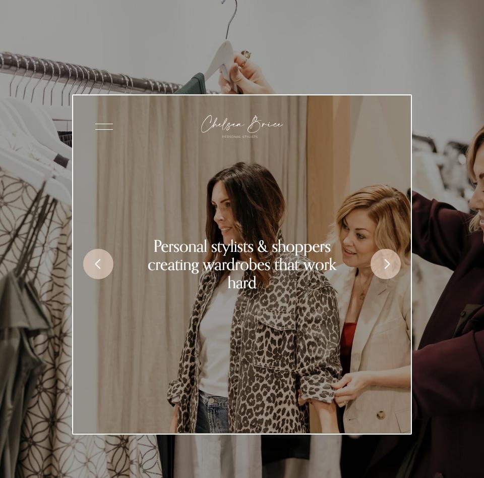
Chelsea Brice is a personal styling brand serving clients in Melbourne and Christchurch, offering wardrobe styling, personal shopping, tailored packages for women and men, testimonials, journal content, gift voucher enquiries, and direct contact options. The aim of this project was to redesign the website from the ground up so the brand felt more polished, premium, personal, and easier for visitors to navigate. The finished website presents the business more clearly, highlights the transformation-led nature of the service, and gives users a smoother path from discovery to enquiry.
Client’s Requirements
The client wanted a complete refresh rather than a light visual update. The website needed to better reflect the quality of the brand, create a stronger emotional connection with potential clients, and present the services in a way that felt aspirational but still clear and approachable. It was also important to separate and organise the packages properly, showcase real client feedback, support both women’s and men’s styling journeys, and make it easy for visitors to enquire or get in touch after browsing. The site also needed to support the brand’s broader positioning across Melbourne and Christchurch while keeping the experience personal and boutique rather than overly corporate.
Planning
The first stage of the project focused on understanding the business, its target audience, and the type of journey a visitor would need before feeling confident enough to enquire. Because personal styling is a trust-based service, the website structure had to do more than simply list packages. It needed to introduce the brand story, communicate the process, explain outcomes, and reinforce credibility through testimonials and supporting content. The planning stage therefore centred on mapping a clearer user journey: homepage to service discovery, service pages to package detail, and package detail to contact. Content structure was also reviewed so that the site could present women’s packages, men’s packages, testimonials, contact details, journal content, and brand messaging in a more intentional way.
Development
This was a full redesign from scratch, which meant rethinking both the visual style and the page structure. The new design was built to feel elegant, confident, and fashion-led while still being easy to use. Large imagery, softer spacing, cleaner typography, and stronger content hierarchy were used to make the site feel more premium and editorial. On the homepage, the messaging now introduces the brand clearly, explains the styling philosophy, highlights the transformation clients can expect, and guides visitors toward the most relevant package pages. The site also makes strong use of testimonials, gifting prompts, subscription opportunities, and clear enquiry paths to help convert interest into action.
The service pages were especially important in this project. Instead of leaving users unsure about what each package includes, the redesign gives each service more room to explain who it is for, what the experience involves, and what kind of result the client can expect. The women’s packages page now presents multiple styling options with clear descriptions, while the men’s packages page follows the same approach for a different audience. This makes the website more informative, more persuasive, and much easier to browse.
One of the main challenges in this kind of project is balance. The site needed to feel stylish and high-end, but not so minimal that it lost clarity. It also had to feel personal and warm, because the business is based on trust, confidence, and transformation. Another challenge was making sure the navigation stayed simple while still supporting multiple service types, testimonials, journal entries, and contact options. The redesign solved this by giving each major part of the business its own place within a streamlined structure, helping users move naturally through the site without feeling overwhelmed.
Release and Testing
Before launch, the redesigned website needed to be reviewed not only for layout and branding consistency, but also for usability. That included checking navigation flow, responsiveness, readability of longer content sections, visibility of key calls to action, and making sure visitors could move easily from package discovery to enquiry. Particular attention was given to how the homepage introduced the business, how service pages handled longer descriptive copy, and how trust-building areas such as testimonials and contact information appeared across the site. Because the business depends heavily on personal connection, the experience had to feel smooth and reassuring on both desktop and mobile.
The End Result
The final result is a far more polished and strategically structured website that feels aligned with the Chelsea Brice brand. It presents the business as a premium personal styling service, gives users a much clearer understanding of the available packages, and uses social proof, storytelling, and strong visuals to build confidence. The website now supports the brand with a more professional online presence while making it easier for potential clients to understand the offer and take the next step. It also creates a stronger foundation for ongoing marketing, content publishing, and future growth.
This project reinforced how important structure is in service-based websites, especially where the purchase decision is emotional rather than purely transactional. For brands like this, a website has to do several jobs at once: look credible, feel personal, explain the process, and reduce uncertainty. A full redesign made it possible to bring all of those elements together in a more cohesive way and turn the website into a stronger sales and trust-building tool.